TrendsFrom a post in a usenet discussion, the following statement has been extracted:
The above tells me the bias of the poster. It is the squirming of a worm on a hook. If the trends being discussed are correct, then, ipso facto, The doom and gloom argument is correct. No one wants to live what the doom and gloom portends, thus the non logical squirming. Also, from the same poster was the following statement:
Anyone can predict the future. The question is, "How accurate is this prediction?" The following will be a decimation of the poster's above quoted logic! From the US Census website, I gathered the population data. I will use these figures to test my "estimates, projections, guesses and very nice looking graphs". |
||
This is what the population history chart would have looked like right after the census in 1850. It does not take a genius to look at the line and extrapolate where the 1860 dot will lie. 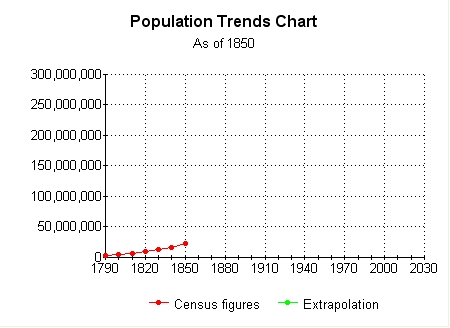 Any human can look at this chart, and with reasonable success, interpret the trend and subjectively place the next dot on the correct Y co-ordinate for the year 1860. I will now open this jpeg image and place the next 3 data points just by visual orientation. |
||
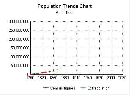 In this chart, my green dot extrapolation for 1880 is a population of about 43 million. This is an estimation based upon a very pretty graph. Now to test it..... The next graph includes the next 3 census counts. Now we can look and see what the difference is between projected and actual. |
||
In this image, I have overlaid and merged the projected population image on top of the actual image. The three extrapolations are a touch low. 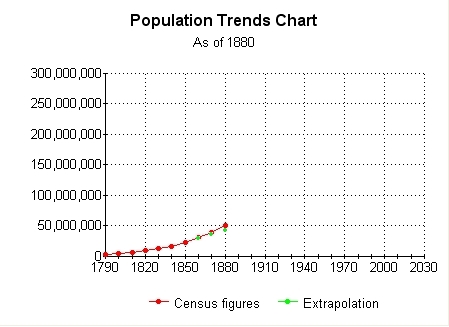 How much was it off by? The actual figure for 1880 is 50.2 million. Subtracting the visually estimated 43 million the difference is 7.2 million. The margin of error was 14.3%. A visual extrapolation that is within 15%. |
||
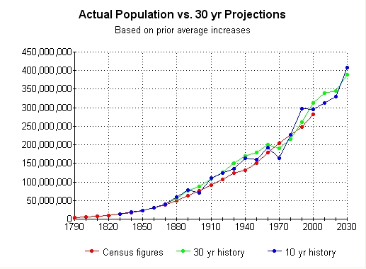
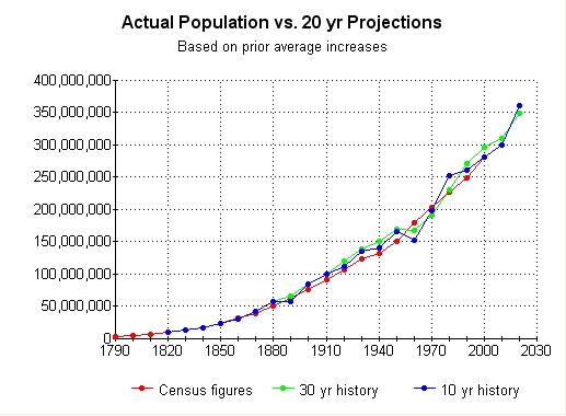
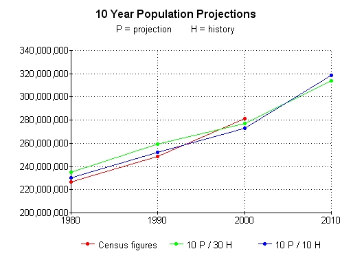
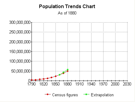 Perhaps. In this chart I averaged the past percentage of population change from 1790 to 1850. This percentage is then used to extrapolate the next 30 years. From the chart above, the difference between the green dot and the red dot is about 15% the other direction. Two different methods of extrapolating a trend have bracketed the actual population gain. Since we do not have to wait ten years to add each new data point, I can show the accuracies of 10, 20, and 30 year projections as compared to the actual population data. There are Four charts. The first chart shows 30 year projections. The second chart shows 20 year projections. The third chart shows 10 year projections. And the fourth chart shows projections just for the years 2000 and 2010. |
||
 The actual population numbers collected in the census is an indication of..... the population. The numbers are not the population, the numbers are a symbol of the population. The population itself, is symbolic of the conditions and environment that the population exists in. If the conditions maintain a steady state, the population is going to maintain a dynamic equilibrium with those conditions. The steady growth of population indicates that the conditions are adequate for the human life forms. A steady state in this case means enough resources for life. ie. food, water, shelter, etc. |
||
 The population chart shows that the race of humans has had a very easy existence. When the conditions are not as beneficial it can be seen in the chart. If you view the 30 year chart just above, you can see the red dots of the actual population counts from 1910 to 1960. Note what happens to the smooth increasing curve at the 1940 point. The non-beneficial conditions of world war II can be seen in the population increase that was lower than the increases just before and just after 1940. |
||
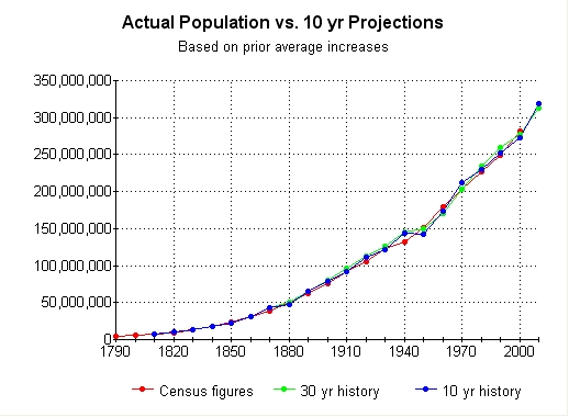 Please note that the 10 year history tracks the closest to the actual figures. Also please note that the 10 year projection based on a 10 year history is within 3% of the actual population census count. |
||
Read 'Em an' weep. |
||
I just recently found this page on my local drive. I had forgotten all about it. It was last saved on 3/23/2003. It is now 6/08/2007 as of this date of my finding it. Just 3 more years until the 2007 census. 7 years (2003-2010) just to see who is going to win an arguement on the internet in regard to "doom and gloom projections". I AM going to win this argument, and I wish I was not. |